The SSFCU Contact Us page was viewed over 216,000 times in 2021 as members sought a way to contact a member service representative. The process involving an arduous series of steps including verifications, back and forth emails which lead to drop-off, and poor member experience as emails take days and/or weeks to respond to.
In addition, the page contains irrelevant info, duplicate content, and a cluttered UI. Contributing to less ease of use and navigation for members.
Improving the Contact Us page will allow members to more efficiently utilize self-service options such as our Virtual Assistant and be directed to more efficient contact methods such as Secure Messaging. Eliminating some email inboxes will allow a more efficient way of communicating with members who need assistance.
Conclusively, a reduction in turn-around time when talking with members, and more efficient UI pathways for the user to find relevant contact information.
I led the redesign of the Contact Us page from the discovery phase through deployment. I collaborated with 2 product owners, 2 other designers, and various stakeholders. I conducted research, built the wireframes, presented the prototypes to stakeholders, and worked alongside designer collegues to develop the Contact Us page.
The total time from start to finish took about 6 months.
I started the discovery phase by conducting a competitive analysis on other credit union's Contact Us pages. Most of the competitor's Contact Us pages contained self-service UI paths in the form of card matrixes that funnel the user to various articles, FAQs, and product pages.
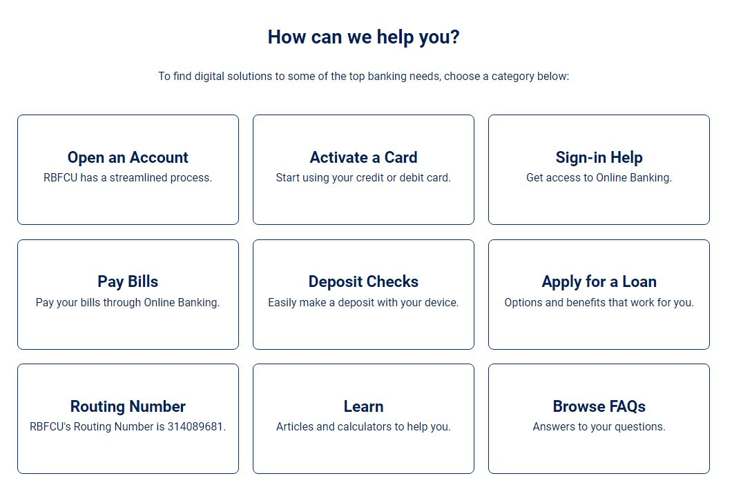
Due to the business constraints of needing to retain a directory format, I opted for an approach that would keep the contact numbers, but de-emphasize them by moving them further down the page. I then added a matrix format at the top which contained paths for the user to take for more self-serve options.
Emphasizing the Virtual Assistant feature and "Secure Messaging" feature would lead to an increase in member utilization of these features and increase Customer Care response and positive Member Experience.
I created two mid-fi options (pictured below) to review with stakeholders with a focus on the matrix component at the top.
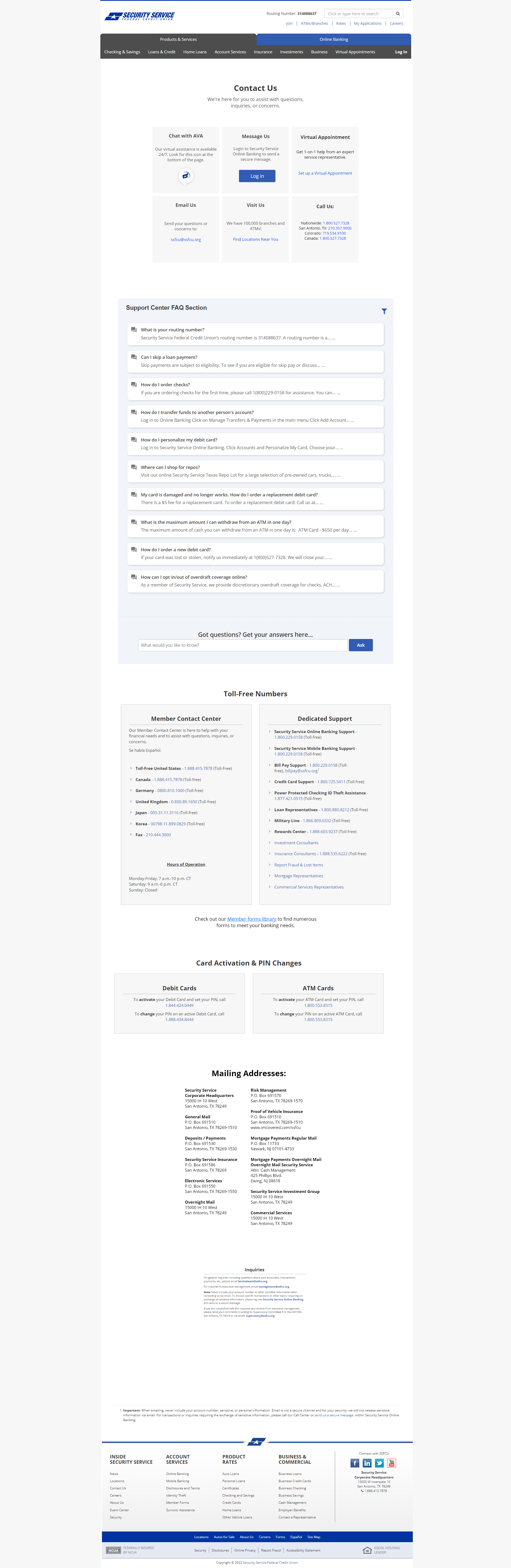
After various review sessions with my Design team and Stakeholders. The following revisions made were made:
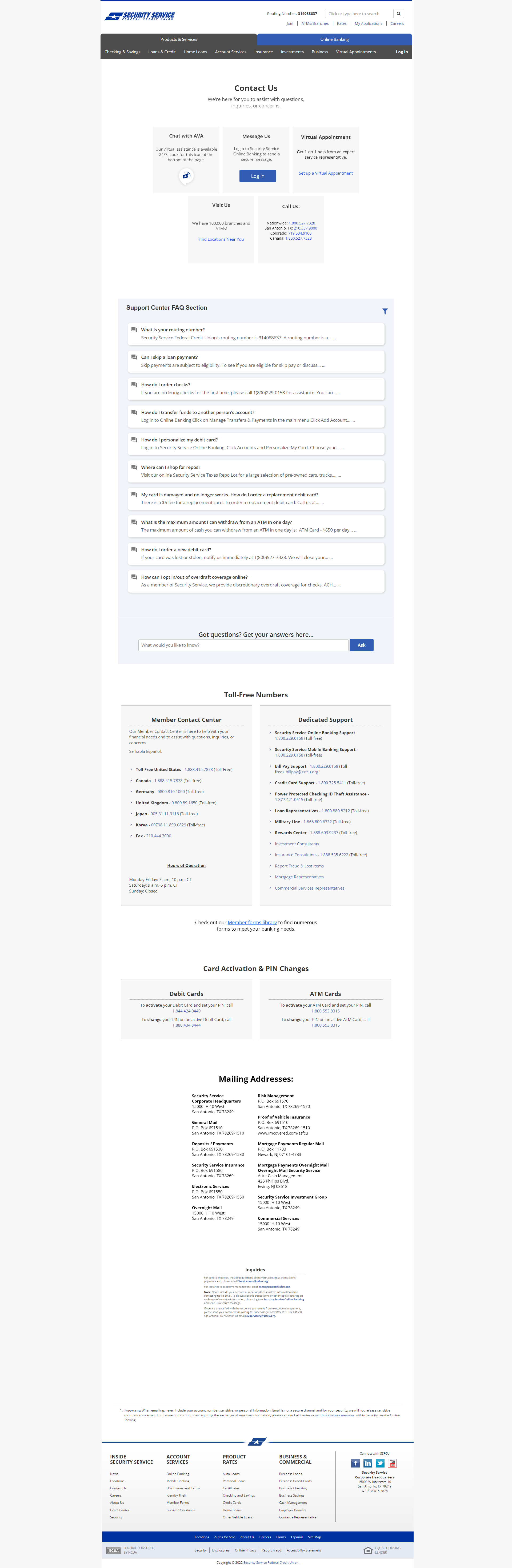
Final reviews with the Line of Business and Stakeholders went well, with only a few minor content revisions.
Website design and content © John Muehl - 2024